Context
Doc Planner's value proposition connects clinics and doctors with patients through a marketplace. Clinics and doctors run their end-to-end business through the SaaS — calendar, patient records, messaging, campaigns, analytics — with a mission to make healthcare more human.
Framing the problem
Each month, users create over 5 million administrative bookings through the SaaS calendar — 80% of all bookings on the platform. This flow is highly complex, touching invoicing, patient registration, follow-up care, retention and no-shows: improvements here can move the entire business.
Goal: make the SaaS more efficient, increasing secretary engagement and growing acquisition and retention — especially for large clinics.
Main problems to solve
- A broken end-to-end experience — users jumped between modals and screens, losing focus easily.
- Inconsistent interaction and design patterns when editing or viewing information, driving high cognitive load.
- Hard to scale — integrating acquired companies was difficult due to legacy code and a lack of scalable components.
- Lack of context for sub-tasks, so users got lost easily.
Project genesis and team involvement
What began as a side initiative by two product designers quickly gained traction among product leads. It tackled a long-standing, unresolved challenge that had been unprioritized due to its complexity — and as the potential impact became clear, it was formally adopted into the roadmap.
Establishing metrics for success
Given the strategic nature of the project, product leadership was closely involved. Early targets for Q1–Q2 2023 included:
- First deployment to production during Q1 2023.
- Appointment booking flow scoring a CSAT greater than 4 from beta testers.
- Migrating frontend components from Angular to Vue.
Process & approach
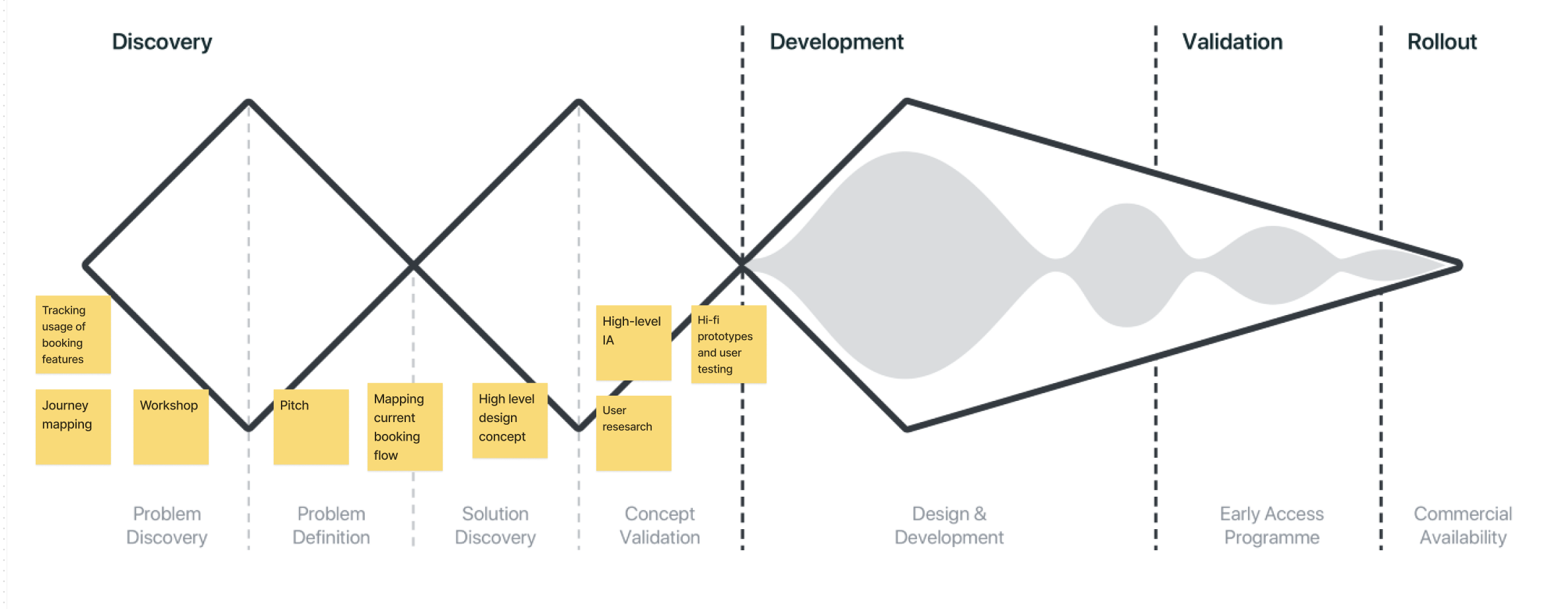
We consistently applied the Double Diamond framework — divergent and convergent thinking in equal measure. Research and testing are, to me, essential to delivering user-centred solutions: from quick hand-drawn sketches to MVP-level prototypes, refining iteratively against clearly defined pain points.
1. Personas
Originally optimized for individual doctors, the platform had to evolve as the company expanded into clinics with multiple roles — admins, receptionists, secretaries, doctors, support staff. We focused on two key personas: individual doctors and clinic receptionists. Role variability was a real challenge — some secretaries focus purely on check-ins, others on follow-ups — so we mapped roles and workflows before designing.
2. Data analysis
We dove into the problem using internal data and tools like Tableau and Mixpanel, uncovering valuable insight into key flows such as patient creation and search.
3. Primary research & insights
We began with internal interviews with customer specialists — invaluable given their daily contact with users — before moving into secondary research and early concept visualization.
4. Collaborative insight mapping
Working with the PM, data analyst and user researcher, we mapped insights from primary research into opportunities across scenarios — generating many potential directions given the feature's broad reach.
5. Journey mapping
We mapped every touchpoint across the check-in and check-out flows into a full end-to-end journey — surfacing the main broken experiences and opportunities to fix them.
6. First assumptions to validate
- A consistent flow to manage appointments increases efficiency and engagement.
- Users need total control over the main task at hand, regardless of context.
- Building the new flow from design-system components increases scalability.
Concept — from insights to design sprint
With insights from workshops and research in hand, we ran a focused design sprint:
- Day 1 — Divergence: shared research findings, mapped clinic roles involved in bookings, identified key pain points.
- Day 2 — Ideation: sketched and presented ideas, selecting two concepts to move forward.
- Day 3 — Prototyping & testing: built initial prototypes and ran in-house tests with end users, with the full team involved throughout.
We developed two distinct prototypes — a draggable modal (a floating window users could dock to the side, inspired by Google Calendar) and a collapsible drawer (a side panel users could open or collapse without losing booking context). Both were tested with 10 users across Mexico, Spain and Brazil, with strong UX metrics and enthusiastic feedback.
Design solution
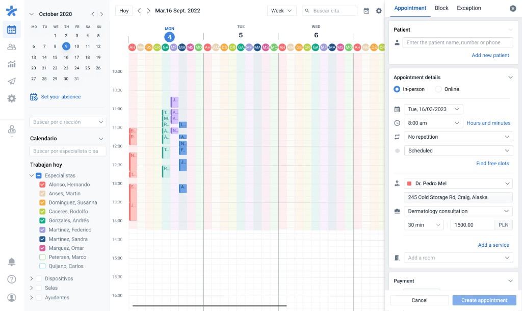
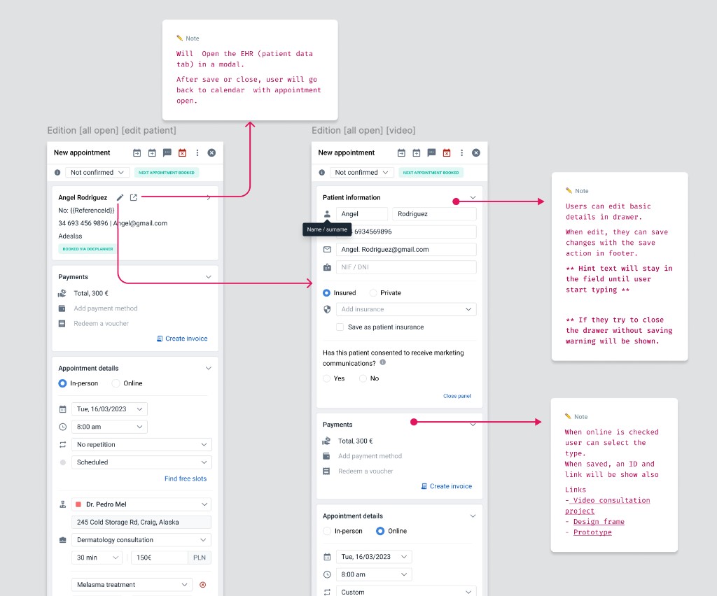
Based on testing and team discussion, we selected the collapsible drawer for its flexibility and usability, refining it through Q3 2022 into the final design.
Key benefits
- Users can create and reschedule appointments without losing calendar context.
- A cleaner, more organized interface.
- Grouped actions that reduce cognitive load.
- Smarter, contextual warnings based on user actions and timing.
Challenges and learnings
This was a deep product immersion that pushed my growth within the company — structured communication, a consistent design process, well-organized documentation, and learning to navigate technical constraints without losing momentum.
Achievements
The functionality rolled out gradually across all countries as we gathered feedback and iterated — it's now in production everywhere, with excellent feedback from both users and internal stakeholders.